
Penobscot General Contractors
This client changed their name, and we were brought in to establish the rebrand. Their focus was future-forward while leaning on their tested experience and expertise within the industry. With this intention in mind, they were looking for completely fresh logo and branding that positioned them well as a future national brand.
What differentiated PGC from other companies was their low overhead and lean, agile operations. They also gravitated toward simple but impactful branding. This minimalistic approach allowed us to steer clear of building imagery, which differentiated them from the rest of the market.
Development / Iteration:
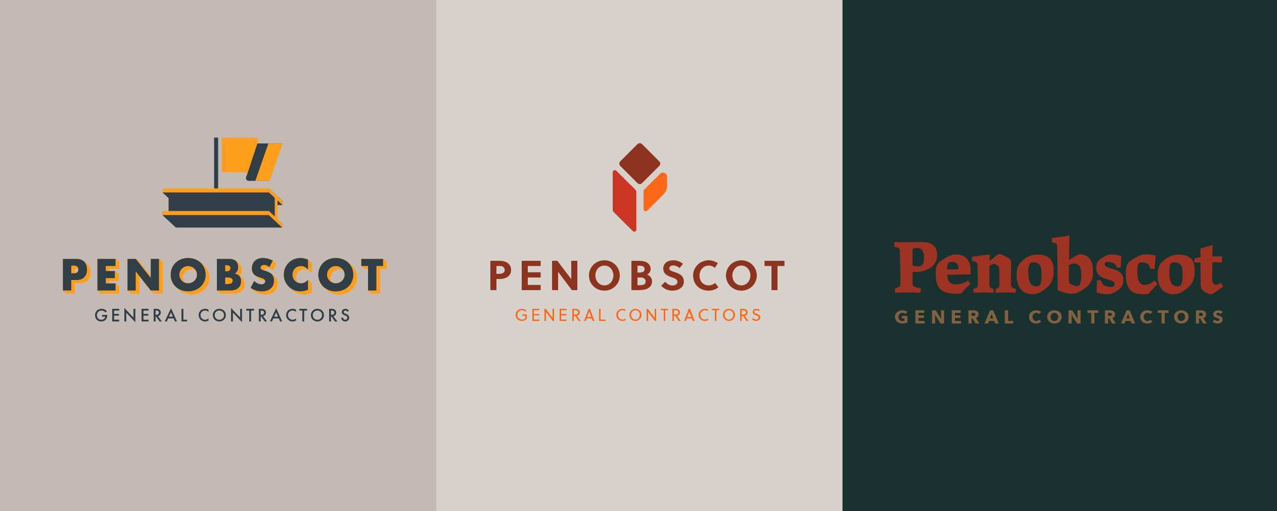
The first round presentation included a range of marks intended to guide the discussion. We set out to provide options that communicate their core message in different ways. While they felt some of the marks didn’t represent themselves in the industry, they did respond to the PGC industrial typography. After nailing down the specifics, we were ready to move forward with this mark.


they were looking for completely fresh logo and branding that positioned them well as a future national brand.
Final Implementation:
The new brand nicely represents the simple feel we landed on while still differentiating them from competitors. This provided us with a great deal of flexibility when developing their rebranded materials.
We decided to use the P as a standalone design element, which turned out to be an excellent implementation. This usage confirmed again that we built a logo that was simple, distinct, and flexible.


