Overlock Design Company: Branding
Research
Kyrie is a local web developer that I have been working with for several years. She liked her branding but wanted something more polished. The color palette was an area that she really wanted to update, as she felt like it didn’t work together in a cohesive way. By using a mood board we were able to fine tune the direction and feel of the brand; fun but not too whimsical, polished but not too technical.
Development/Iteration
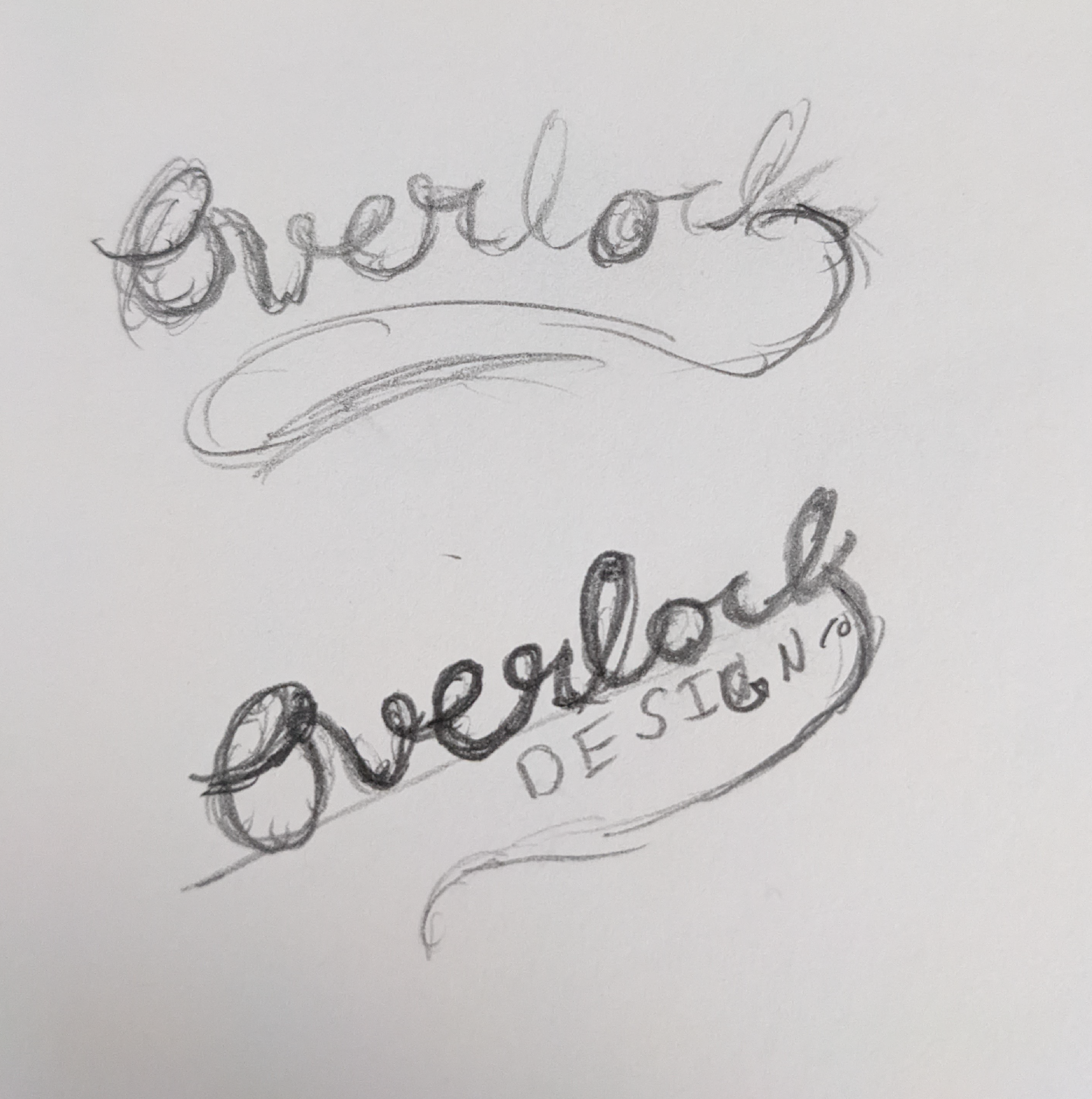
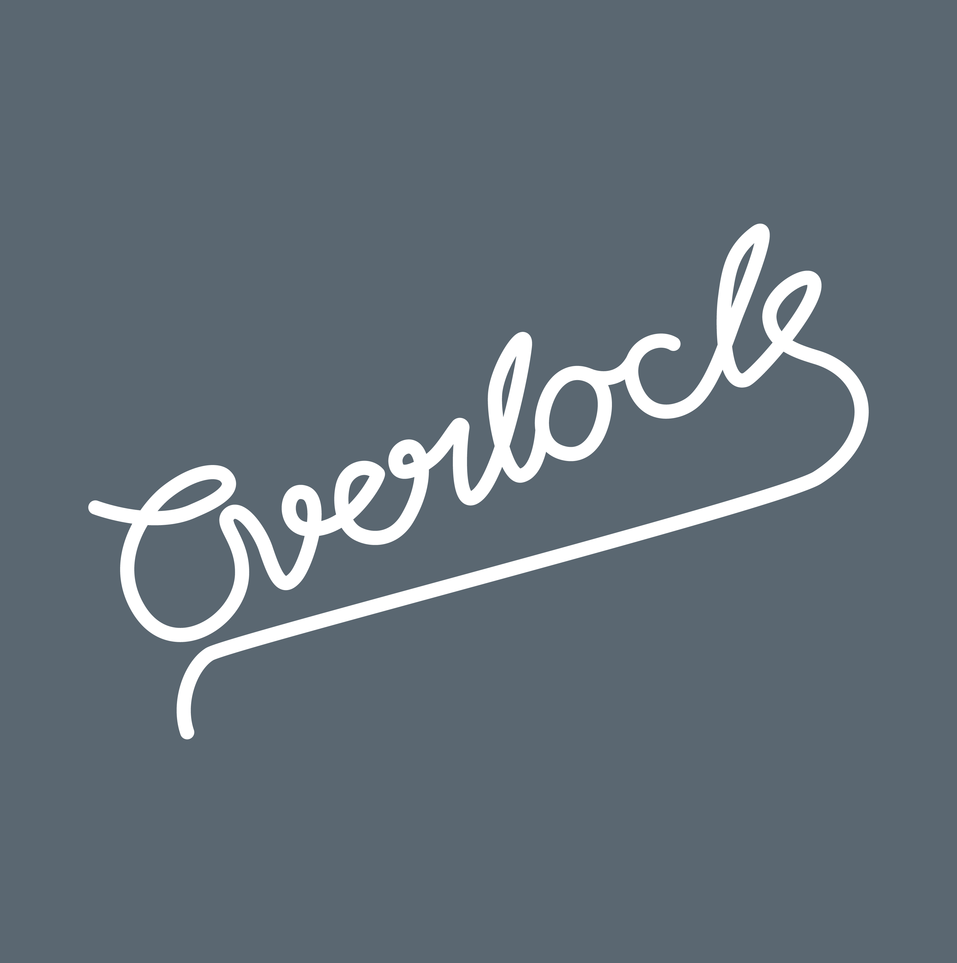
My first thought was that the original brand was something I could easily work with. She still liked aspects of it, but I knew it needed to be made more modern and a bit more edgy. My initial conclusion was to use a custom mono-line logo type.
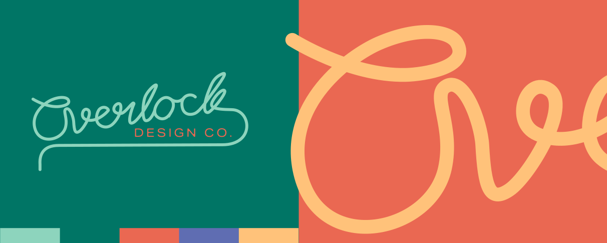
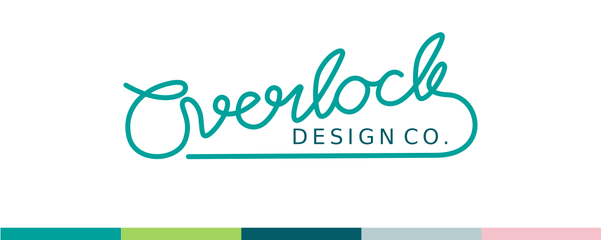
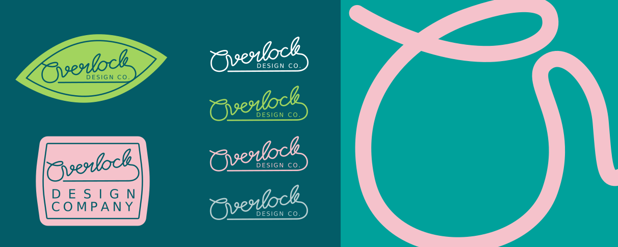
The the final result is a modern brand that has the flexibility in both branding and color palette to allow Kyrie to showcase her work.
Final Implementation
The first design option was pretty close, but she really wanted to take a look at the color palette. After developing a few color options and a polishing of the logotype, we arrived at the final product; a modern brand that has the flexibility in both branding and color palette to allow Kyrie to showcase her work.