Edgewater Physical Therapy: Branding
A local physical therapy office sought a rebrand that captured their vision. I visited their office to get a sense of their practice, which has a strong foundation in referrals and long-term patient relationships.
Their existing brand was outdated, and they wanted a refresh that would carry them through the next phase of growth, including a new focus on sports medicine. They envisioned a logo that would convey themes of activity, nature, community, and care, with a subtle nod to athletic branding.
Development / Iteration:
During our mood board meeting, they were drawn to nature-inspired imagery, with a balance of athletic branding elements.
In the first design round, I presented two options:
Option 1: A modernized version of their existing brand with abstracted nature themes, aligning with athletic branding while representing nature and recovery.
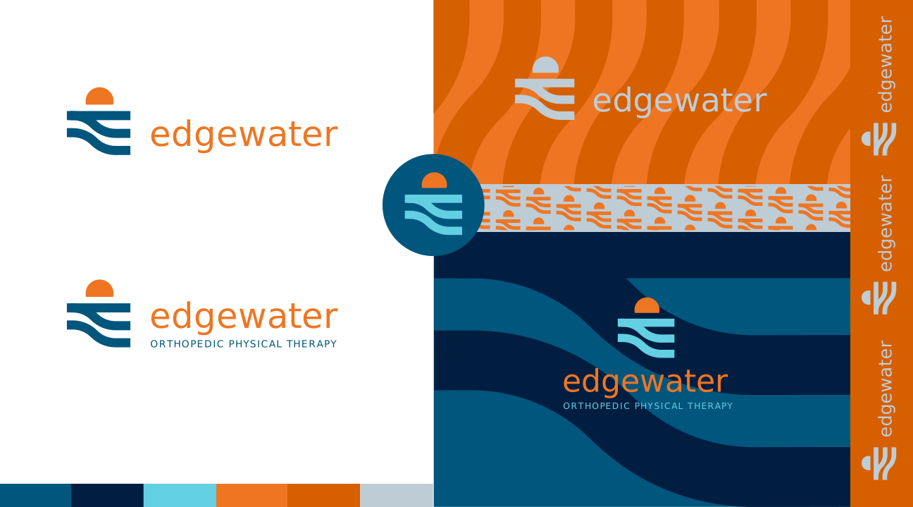
Option 2: A sunrise-inspired mark with a directional element to symbolize guidance and support.”

The client liked both options they eventually chose the first option, and after refining the typography and color palette, we arrived at a final design.
Final Implementation:
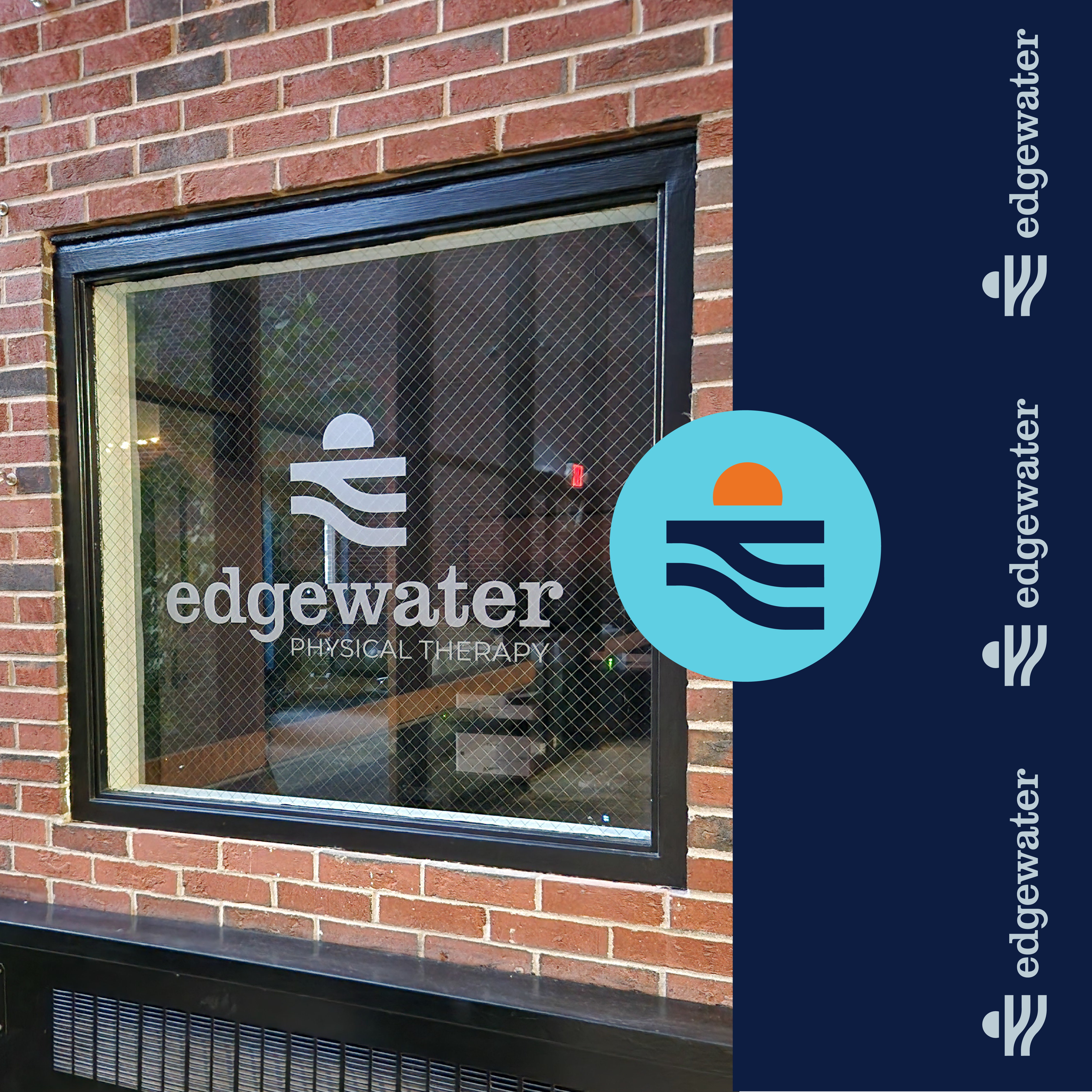
The end result is a simple, memorable mark with versatility across applications. Patterns derived from the logo add interest and can be used in countless ways, creating a cohesive brand that will grow alongside the business.